Mathematica density and contour Plots with rasterized image representation
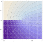
This page is motivated by the discussion of Mathematica's ContourPlot shading here. Hidden in the color map of any height function in such plots is a polygonal mesh as shown on the right.
Here is a (probably incomplete) list of negative consequences:
- As the image shows, gaps between the polygons can show up when exporting to
PDForEPS. - Large file size when exporting to vector formats.
- Slow rendering when embedding the exported graphics into
PDFdocuments. - When your Mathematica notebook accumulates a large number of Density or ContourPlots, the notbook becomes less and less responsive to scrolling and other operations (even saving).
- Creating animations from a list of density or contour plots can be very slow, but gets much faster if one creates bitmaps of the frames first.
- Rasterizing (i.e., bitmapping) a complete plot helps reduce the above problems, but the downside is that axes, frames and contours look pixelated.
List of functions
The solution I'm describing here is to create the color image and line art of the plot separately, and superimpose them only after rasterizing the image portion. The hard part is to make sure that all the usual plotting options work correctly, and that the separate parts are registered (aligned) properly in the final superposition. The following functions should be able to do the job.
- rasterContourPlot and rasterListContourPlot replace
ContourPlotandListContourPlot. - contourDensityPlot combines functionality of
DensityPlotandContourPlot - listContourDensityPlot combines functionality of
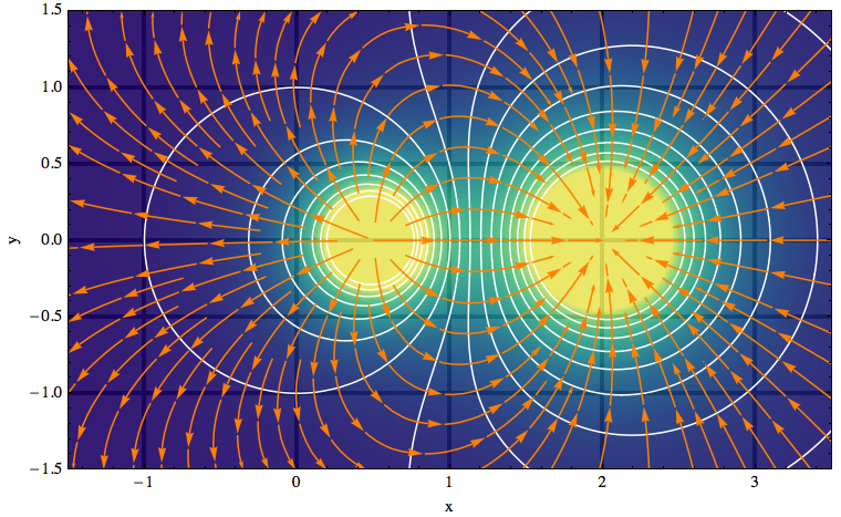
ListDensityPlotandListContourPlot - gradientFieldPlot is inspired by a function of the same name that existed in earlier versions of Mathematica. In my implementation, I combine three plots: a
ContourPlotof the given function, aStreamPlotof the functions gradient field, and a rasterizedDensityPlotof the gradient field strength (the magnitude of the gradient). There is also a version that takes a 2D list as the input potential: listGradientFieldPlot.
By default, these functions draw both a colored height function image and a set of contour lines. This means that two plotting functions are called (density and contour). You can suppress the calculation and plotting of contour lines by simply giving the option Contours->None. Then you have the equivalent of a pure DensityPlot (or ListDensityPlot).
The reason why I don't use a single call to a density plot and simulate the contour lines using MeshFunction is that options such as Contours and ContourLabels wouldn't work in that case, and the resulting graphic wouldn't show tooltips indicating the contour height.
General usage notes (applies to all the above functions)
The image in all these functions can be made translucent by setting the option "ShadingOpacity" to a number between 0 and 1. This is useful when superimposing the plot onto other graphics with Prolog, Show or Overlay.
 There are also plot decorations such as axes, tick marks and grid lines that can be partially revealed or hidden with this
 "ShadingOpacity" setting. In the standard built-in plot functions, it's possible to move grid lines or or axes to the front (or back, respectively) by adding the option Method -> {"GridLinesInFront" -> True} and Method -> {"AxesInFront" -> False}.
However, using opacity you can do better than this either-or choice: an example is the image on the right where I let the grid lines show through in an unobtrusive way because the plot contains so many other families of lines that should receive most of the attention. The plot was made with the gradientFieldPlot function listed above.
The default setting AspectRatio->Automatic for these plot functions can be changed as usual by specifying an explicit ratio of axis lengths. However, you should probably not change this setting for gradientFieldPlot, because then the intersections of contour lines and gradient field lines will not be at right angles (as they should be if both axes are using the same length yardstick – see the example image).
I set the PlotRangePadding to zero by default, but you can change that by specifying it explicitly in the plot command. One way to restore the usual behavior of adding 4% padding to a plot whenever the PlotRange isn't explicitly given is to modify the definition of my plotting functions as follows:
Add PlotRangePadding -> If[FreeQ[{opts}, PlotRange], .04 {-1, 1}.rangeCoords, 0] to the Show statement, just before the options list (Evaluate@Apply[Sequence, frameOptions]). This was motivated by this discussion on stackoverflow.
How do I align contours and color shading?
To make images out of the color shading in the above plots, I use Rasterize. To display the resulting image in a way that is compatible with standard PDF export (my main motivation), I decided I cannot use the technique of adding the image as a texture, as I did in this function to paint text onto 3D polygons (vertex colors can lead to export problems).
In composing a plot from a background image and line drawings as is done here, the biggest challenge is to align everything correctly. The density image is included as an Inset within a rectangle whose dimensions are determined by the PlotRange. I originally used an enclosing rectangle that was defined independently of the plot frame, but then realized that it's not needed if I fix the PlotRange based on the size of the density plot. This still allows PlotRangePadding to be chosen arbitrarily.
In particular when a non-default AspectRatio is specified, the Inset contents have to stretch. Here the Inset documentation states, under Scope > Sizes: "Given both width and height sizes, the inset graphic will be stretched, if the aspect ratio is not fixed." But confusingly, to "not fix" the aspect ratio is not the same as to not specify it. Only by specifying the option AspectRatio → Full do you allow the inset graphic to stretch.
Another pitfall is the use of Scaled coordinates in the inset: the scaling of the included image is supposed to be done with respect to the "enclosing graphic" (the rectangle mentioned earlier) — but Mathematica defines the enclosing graphic to be the outermost one, which may include additional padding (and even other objects if you combine plots using Show). This means that in my code Scaled coordinates can't be used because they aren't insulated from further manipulations of the plot. So I end up having to work directly with the absolute plot range in order to get everything aligned properly.
noeckel@uoregon.edu Last modified: Fri Aug 3 14:31:18 PDT 2018