 |
|||||||||||||||||||
|
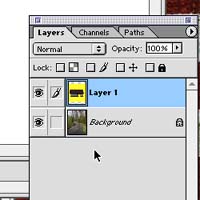
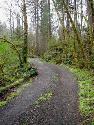
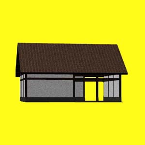
At this point you have two images that you want to put together. The model and the site. (If you like, download my images and follow along. Site and Model) Using Photoshop, paste the model image into a new layer in the background image. Your layers palette should look like the image on the left. |
|||||||||||||||||||
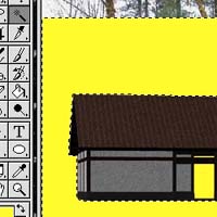 |
The first thing to do is make the model float. Delete the unused background of the model. Use the magic wand or eraser tool to do this. See the tools section of this step for more information. | ||||||||||||||||||
| Once the model floats, it may need to be changed to fit into the site. In the case of the demo, it needs to be rescaled. Under the edit menu, there is a sub-menu called transform. This is where you can find effects such as rotate and scale that work in the layer you are working in and won't effect the other layers. Use the scale effect to make the model smaller. To get the model to remain in the same proportion, hold the shift key while dragging the corner of the selection. | |||||||||||||||||||
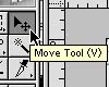 |
Use the move tool to move the model into place over the background. | ||||||||||||||||||
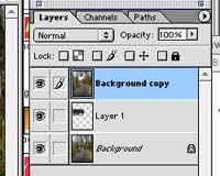 |
Select the background layer and make a duplicate layer. Move the duplicated layer over the model so that you have a sandwich with the model in the middle, as the image at the left shows. Delete areas from the top version of the site photo such that a foreground of the photo remains and is shown over the model. This is illustrated at right. (Use the magic wand, eraser, layer masks and other selection tools in deleting areas.) | 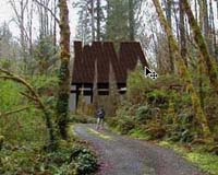 |
|||||||||||||||||
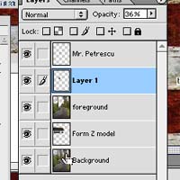 |
The image at the right shows the final layers of this composition as it was done. Just a couple small details remain. The small guy standing in the photo can get easily lost or erased. Its a good idea to have people in there for scale and just a bit of personality-reality. Mr. Petrescu was pasted into his own layer and his surroundings were carefully deleted before he was erased in the other layers. His layer was then moved to the right depth among the other layers.
As a finishing touch, a shadow was added on the wall that is supposed to be the interior of the building. Without the shadow, this wall looked like the exterior. A small black rectangle placed on its own layer (layer opacity set to 35%) gave it some depth. |
||||||||||||||||||
 |
At left is an animation that loosely shows the steps that this image went through in order to get a model placed into the site. The layers are each represented here starting with the background and adding each layer on top. | ||||||||||||||||||
| The following links will give the pieces of this composition, if you would like to experiment with the clipped pieces as they appear in the final layers. | |||||||||||||||||||
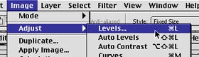 |
The color balance of the layers may sometimes needs to be changed to be convincing, as in this example. Levels and other similar adjustments may be found as illustrated at the left, under the image menu. When adjusting, be sure that you have the layer you want to change selected from the layers window. | ||||||||||||||||||
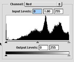 |
The image at right looks far too red to be a match. When opening the level controls, change the channel to adjust the red channel. With some experimentation and watching your preview, one can improve on this. | 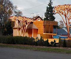 |
|||||||||||||||||
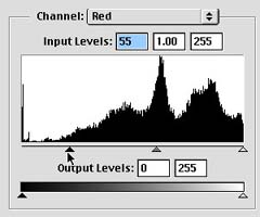 |
The image is adjusted as shown at left. The dark arrow was dragged past the part of the graph that was mainly empty. The model looks less red now. But it still doesn't quite match the overcast nature of the day. Since this isn't an issue of one color overpowering the others, we will work in the RGB channel. | 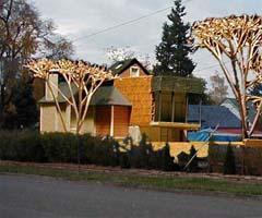 |
|||||||||||||||||
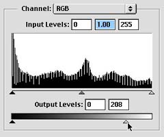 |
Adjusting the white arrow at the bottom, the model has become dingy, and kind of fits in with the Eugene sky. | 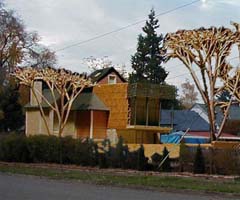 |
|||||||||||||||||